Raise Snacks
“As a busy and active young person, who filled (and still fills) my days with work, exercise, adventure and socialising, I could never find a snack which gave me a natural and tasty source of elevation. Popcorn didn’t fill me up, crisps weren’t the most nutritious and protein bars had ingredients I'd never heard of. So I started asking my mum to make her roasted nuts and seeds so I could snack right, and fuel my busy and active lifestyle - that’s how RAISE came to be."
- Chester, Raise Founder
Raise’s mission is to get people snacking smart again by eating naturally and nutritiously, without having to compromise on taste. With Nigerian heritage, the founder is a driving force in raising awareness on diversity and inclusion, with a future goal of a portion of profits going towards funding POC entrepreneurs / business owners.
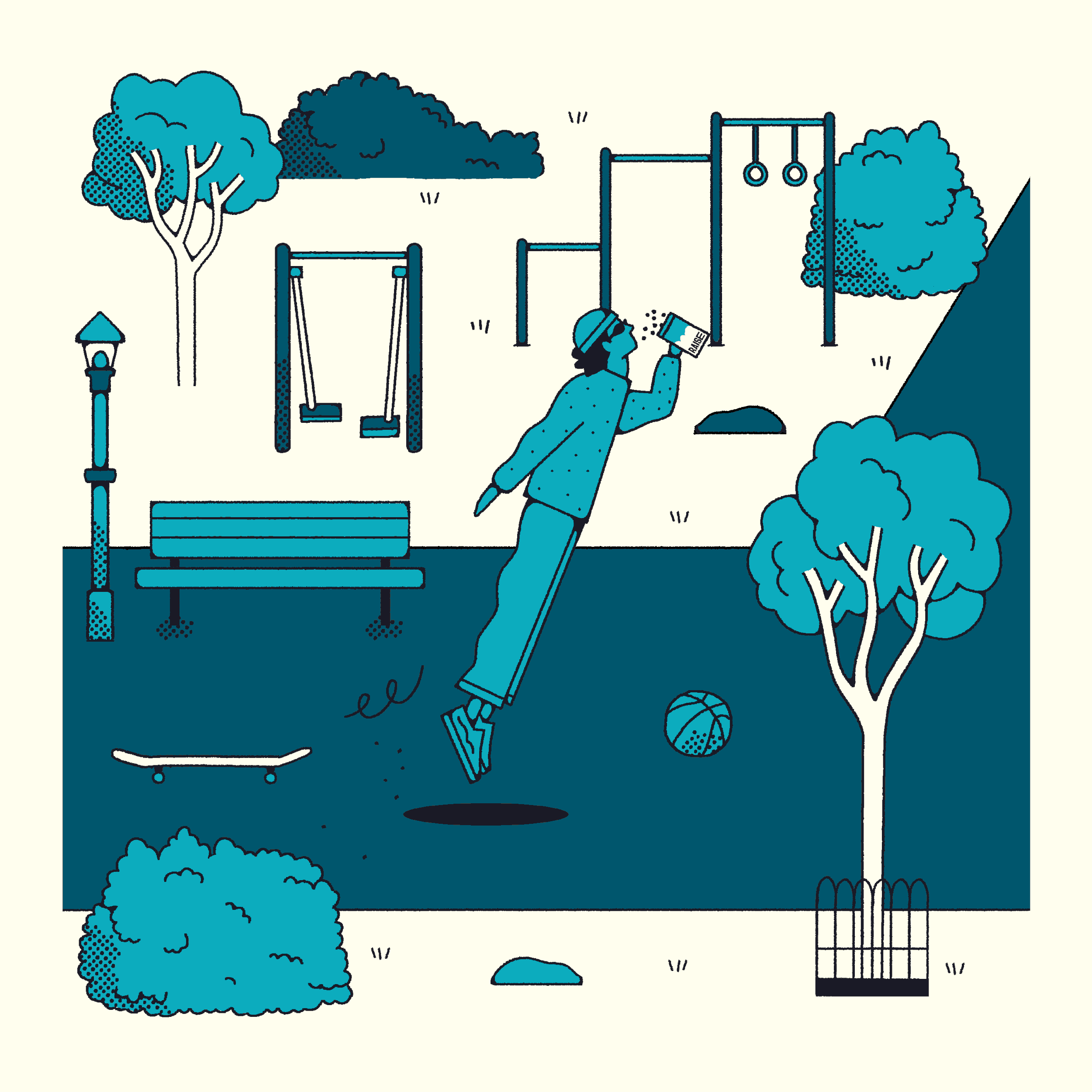
Raise had created a product with an incredible list of product benefits that acts as the perfect companion post work out. But we wanted to step away from the norms in that industry with something that didn’t feel overly masculine or devoid of any personality. So, when first looking at this project we knew we wanted to create something illustrative, some character that really embodied that feeling of natural elevation. Something that was somewhat nostalgic in its styling with visual cues taken from Ligne Claire style cartoons. These were then rendered in a hand drawn style to provide the packaging with a natural, human touch. This styling was applied to all typography and graphic elements across the packaging too. Illustrative clouds are used throughout the identity to provide a feeling of lightness, this is not a product that will weigh you down - its a light lift to give you the elevation you need in the day.
With typography, the logotype is a modified version of Bayard by Vocal Type, a type foundry “working to diversify design through the root of all (good) works of graphic design - Typography.” Each typeface within their catalogue highlights a piece of history from a specific underrepresented race, ethnicity or gender. Using this typeface for the logo and hero font felt appropriate given the founders mission.
Elongated letterforms are a device used to represent that extra kick the product gives you to go that extra mile.
full brand identity - illustration - digital content creation - packaging - POS design - marketing materials - website design - tone of voice